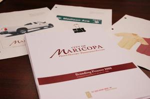
Maricopa has officially branded itself with a city logo and brand which highlight its proud history and hope for a prosperous future.
The City Council and mayor on Tuesday approved a logo along with a 35-page user manual detailing specific guidelines for its use.
The logo, designed by Pat Davis Design Group, Inc., of Sacramento, Calif., was created with substantial input from Maricopa residents who participated in surveys and focus groups. Local input kicked off last spring during the Salsa Festival. In summer 2007 thousands of residents received and responded to mailed surveys, the results of which appeared online at www.maricopamatters.com. City Council approved a budget for the project in July 2006, 15 percent of which funded the survey which went to 13,988 households.
Pat Davis was on hand Tuesday to present the manual and answer questions during the work session before the regular Council meeting. In her opening remarks she praised Maricopa’s residents for being more involved in the process than any other community she’s serviced in 31 years.
“It was heartwarming,” she said.
Mayor Kelly Anderson said he wasn’t surprised.
“I wouldn’t expect anything less from the citizens of Maricopa,” he said.
While a logo and brand have been approved, the creative process will continue indefinitely, because the manual is a living document, city officials said.
City Staffer Danielle Casey stressed the importance of adopting more than a logo, to create a distinct brand.
“A brand is nothing less than what anyone thinks when they see your logo or your name,” she said. “It’s not a one-time, design-a-logo thing.”
The idea, she said, is that when anyone comes into contact with anything carrying the brand that they will “already have an emotional feel about what Maricopa is,” Casey said.
The main message, Casey said, is that Maricopa is “Where everybody wants to be.”
“It is important to remember that a brand is not a logo,” she added. “It’s a promise. It’s emotion.”
Casey cited other cities which have successfully taken advantage of branding including Tempe and Denver to boost their image both among their residents and outsiders alike.
The user manual adopted for Maricopa includes a color palette and fonts with suggestions as to how the logo can and should be used for everything from official letterhead to city vehicles.
Lee Pierce and Jonathan Pierce of Rancho El Dorado are among those who attended on Tuesday who are satisfied with the project’s results.
“I think the part I like the best is where they included the past, present and future,” Lee Pierce said.
Her husband agreed.
“What she said,” Jonathan Pierce said with a smile. “Seriously, I like the history. The input of the history and the pointing toward the future is important. It’s very nice.”
Not everyone was as pleased.
The brand and logo have been available online for some time, and the response from residents has been mixed, Councilman Will Dunn said.
“I got a lot of comments from citizens coming in and out all the time, going to the Web site and not liking it,” he said.
Dunn said his email inbox was full of suggestions and artwork from people who felt they could design something better than the logo the city adopted.
“I don’t know if you guys got them, but I got a ton of them,” Dunn said.
Even so, Dunn remained upbeat about the logo and said he believed those who dislike it are in the minority.
“It really makes me feel good to see the results of it,” he said.
Photo by RuthAnn Hogue


![State: Pinal County fire activity concerning Tucson's Northwest Fire District crew members assist in firefighting efforts on the "Flying Bucket Fire" approximately 15 miles southwest of Maricopa on May 8, 2024. [Northwest Fire District]](https://www.inmaricopa.com/wp-content/uploads/2024/05/GNEq06pbwAA6JlT-218x150.jpg)

![Carl’s Jr plans to “open soon” An exterior view of the new Carl's Jr. restaurant along John Wayne Parkway on May 7, 2024. [Elias Weiss]](https://www.inmaricopa.com/wp-content/uploads/2024/05/E1C66482-CB4C-4FD0-BA30-35CECE93F4BE-218x150.jpeg)
![Traffic change to reduce backup at Villages intersection The intersection at Butterfield Parkway and West Edison Road on May 10, 2024. [Brian Petersheim Jr.]](https://www.inmaricopa.com/wp-content/uploads/2024/05/PJ_5644-218x150.jpg)


